
How A Colour Wheel Can Improve Food Plating
What is a Colour Wheel?
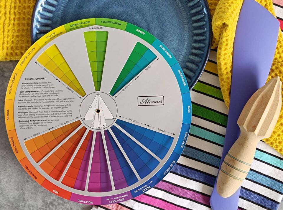
A colour wheel is a circular diagram that shows the relationships between colours. It helps people understand how colours work together, contrast with each other, and create different visual effects.
The wheel is usually made up of:
- Primary colours - red, blue, and yellow
- Secondary colours - colours made by mixing primaries, such as green, orange, and purple
- Tertiary colours - colours made by mixing a primary and a secondary colour
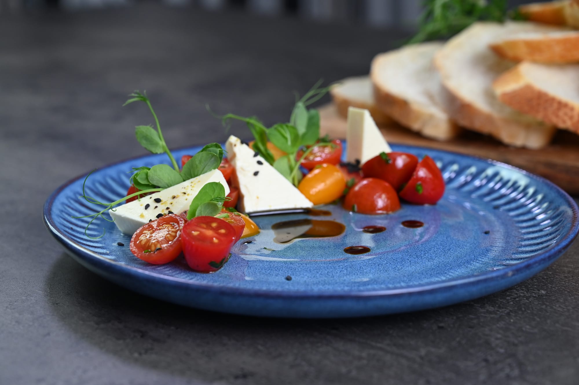
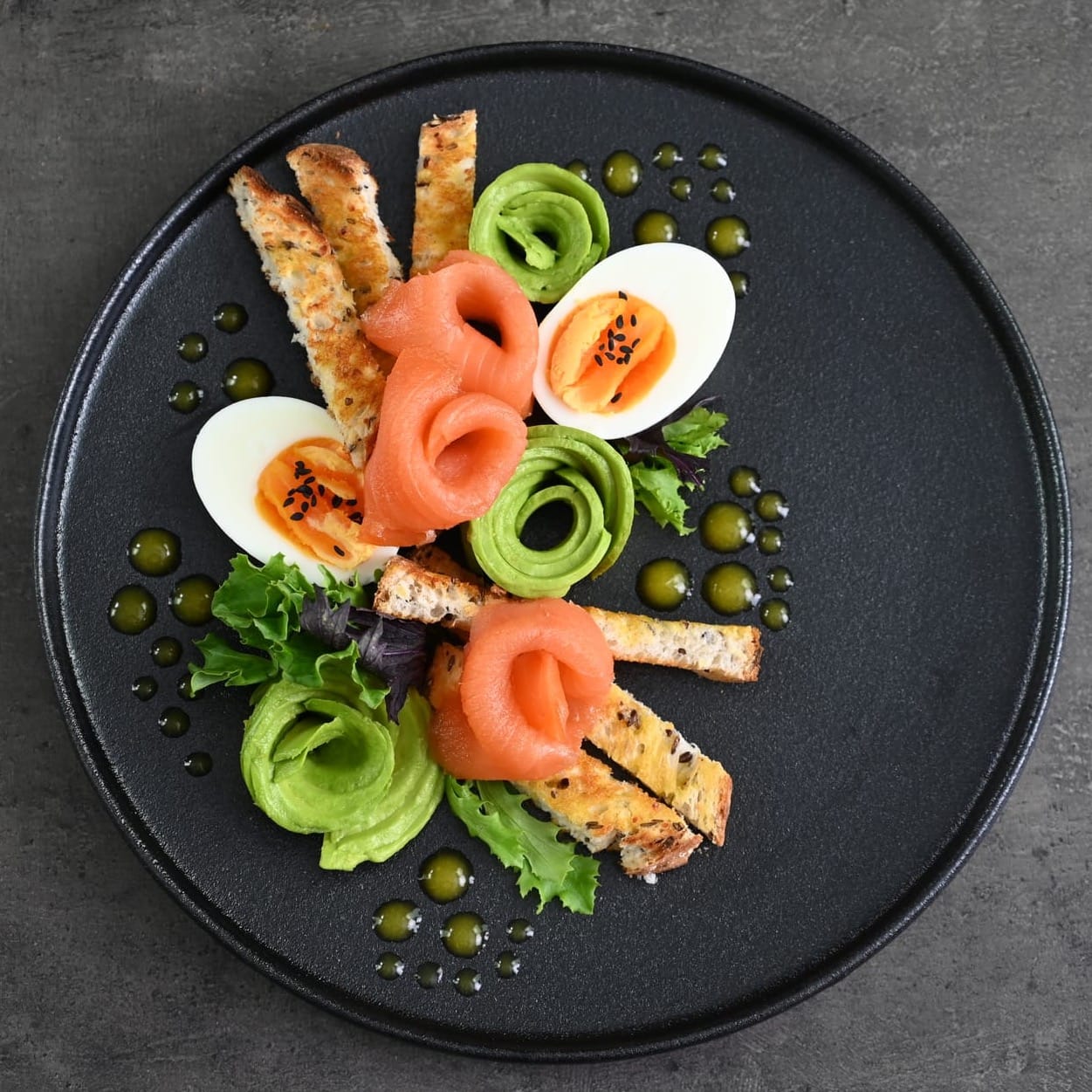
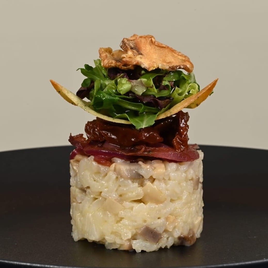
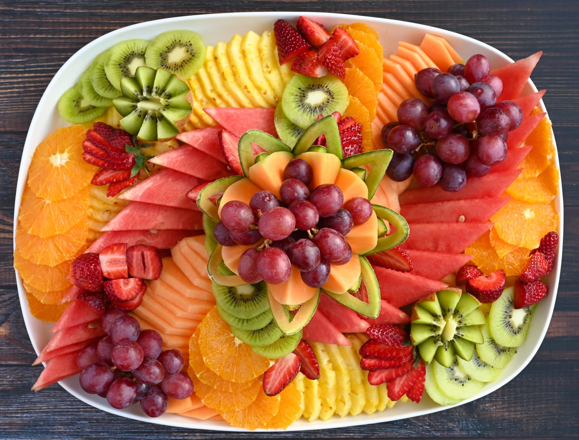
A few examples of complementary colours and colour contrast on plated dishes.
In the Kitchen
In the kitchen, a colour wheel guides us in creating dishes that are visually captivating and memorable. By using the basic principles of colour theory, anyone can transform ordinary plates into works of art that delight the senses and elevate the dining experience.
I keep a colour wheel handy when I'm designing a dish, plating, or even thinking about different table setting options:
- It can be used to help you choose colours that will enhance the visual appeal of a dish by guiding you in selecting complementary and harmonious colours. A well balanced colour scheme makes a dish more enticing and pleasing to the eye.
- It can help you to understand contrast and balance. Contrast, created by complementary colours (opposites on the colour wheel), can make different elements of a dish stand out. On the other hand, analogous colours (next to each other on the wheel) can create a more balanced look.
- It can help you choose a plate colour that will make your food stand out. The key to using coloured plates is to pick colours that support and highlight your creation instead of overwhelming and/or detracting from your presentation.
While taste is the most important part of any dish, presentation is a very close second as it plays a significant role in how food is perceived and enjoyed. Putting thought into colour helps to ensure each dish is as satisfying to the eyes as it is to the palate, enhancing the overall dining experience.
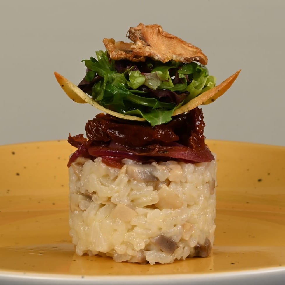
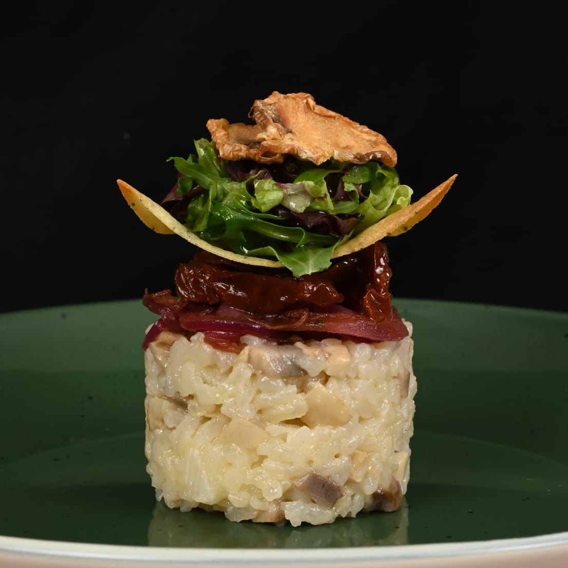
The same entree served on different coloured plates gives it a completely different feel.
Specific Colour Choices
A colour wheel can help guide you to create a visually stunning plate presentation by helping you choose complementary or contrasting coloured garnishes, sauces and plates that make the main components of the dish stand out. This attention to detail can elevate the overall dining experience and leave a lasting impression on diners.
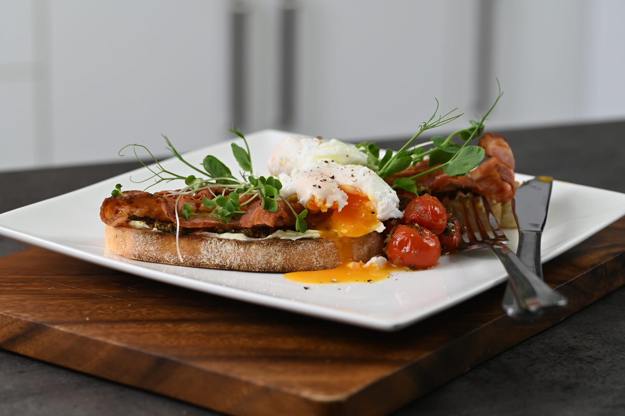
Understanding colour psychology can help us create dishes that are visually appealing and increase the perceived tastiness through the food colours we choose and put together. Warm colours like reds, oranges, and yellows are often known to stimulate appetite or make food appear more appetising.
Seasonal ingredients often come in specific colours too. We can use a colour wheel to help us match the colour palette of a dish with the season. This creates a connection between the visual presentation and the freshness of the ingredients. For example:
- In Summer a dish built around ripe tomatoes, fresh basil, and bright stone fruit reflects the vibrant colours of the season in the natural reds, greens, and golden tones.
- In Autumn a dish leaning into the deeper, earthy colours like roasted pumpkin, beetroot and dark greens creates a warm, rich palette that visually mirrors the heartiness and comfort of the season.
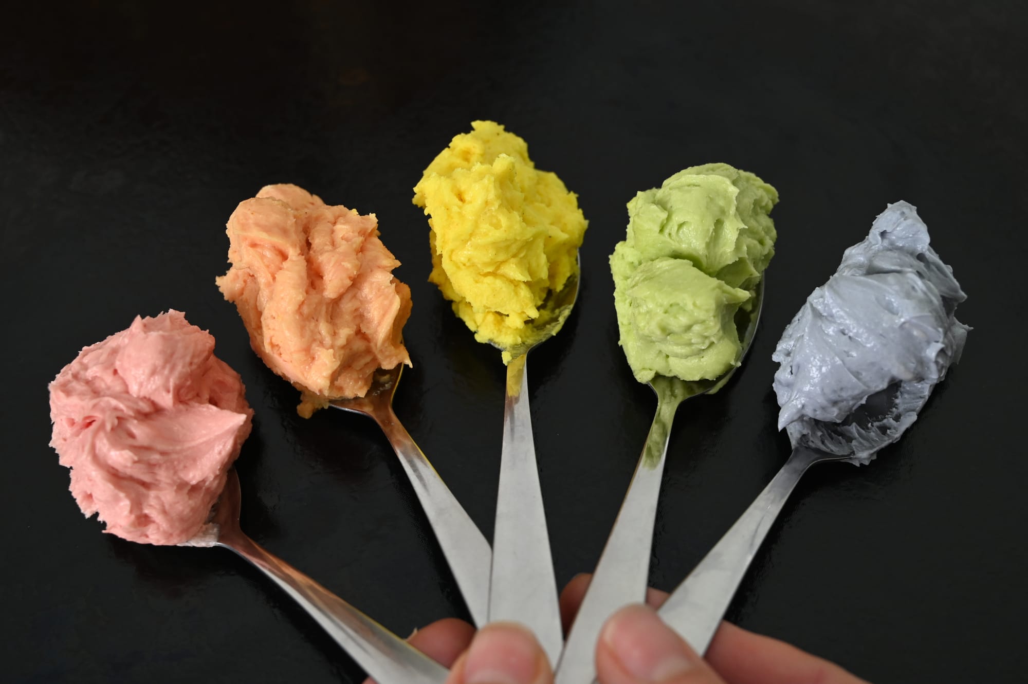
Vibrant colours look appealing.
Complementary and Analogous Colours
Complementary Colours
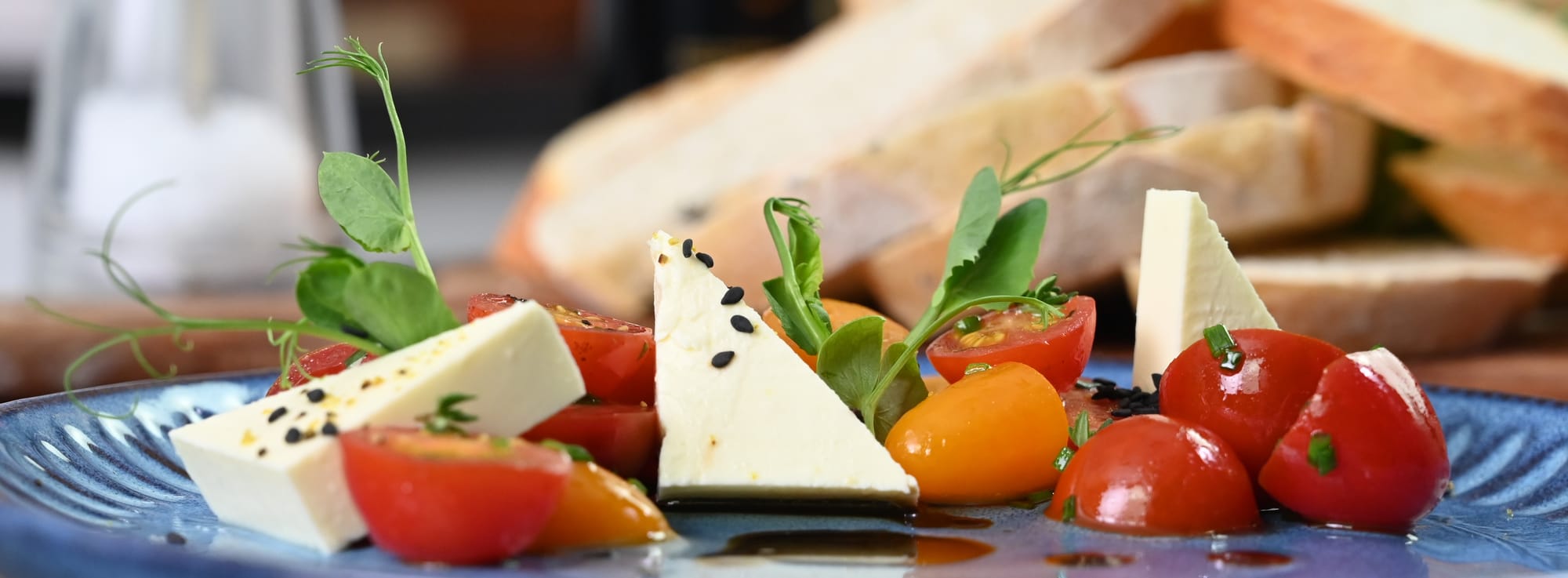
Complementary colours sit opposite each other on the colour wheel, and when used together, they create a natural contrast that makes a dish visually stand out. Pairing food with complementary tones, like vibrant greens with deep reds, or golden yellows with rich purples, can instantly make your plating look more balanced, intentional and appetising.
Another example of complementary colours is when you are serving meatballs with red tomato based sauce, don’t be afraid to choose green dinnerware. Or if you are serving a green salad, try using a red bowl to draw your guests eye and create a stronger presentation.
Analogous Colours
Analogous colours sit next to each other on the colour wheel and create a much softer look because they blend naturally rather than contrast. In plating, this might be using different shades of green and yellow for a fresh, cohesive feel; or reds, oranges and pinks for warmth without sharp contrast.
Analogous colours are perfect when you want a dish to feel calm and cohesive, as the gentle shifts in tone create a natural flow across the plate rather than drawing attention to any one element.
A colour wheel is a simple, but powerful tool that can completely transform the way you approach food presentation. By understanding how colours work together - whether through bold contrast with complementary tones, or soft harmony with analogous shades - you can create plates that feel more balanced, intentional, and visually appealing.
With just a little thought to colour, every dish has the potential to look as impressive as it tastes, leaving a lasting impression before the first bite is even taken.
Next time you're designing a dish or plating something, have a quick look at a colour wheel and maybe it'll influence your plate or garnishing choices.