
Colour Wheel
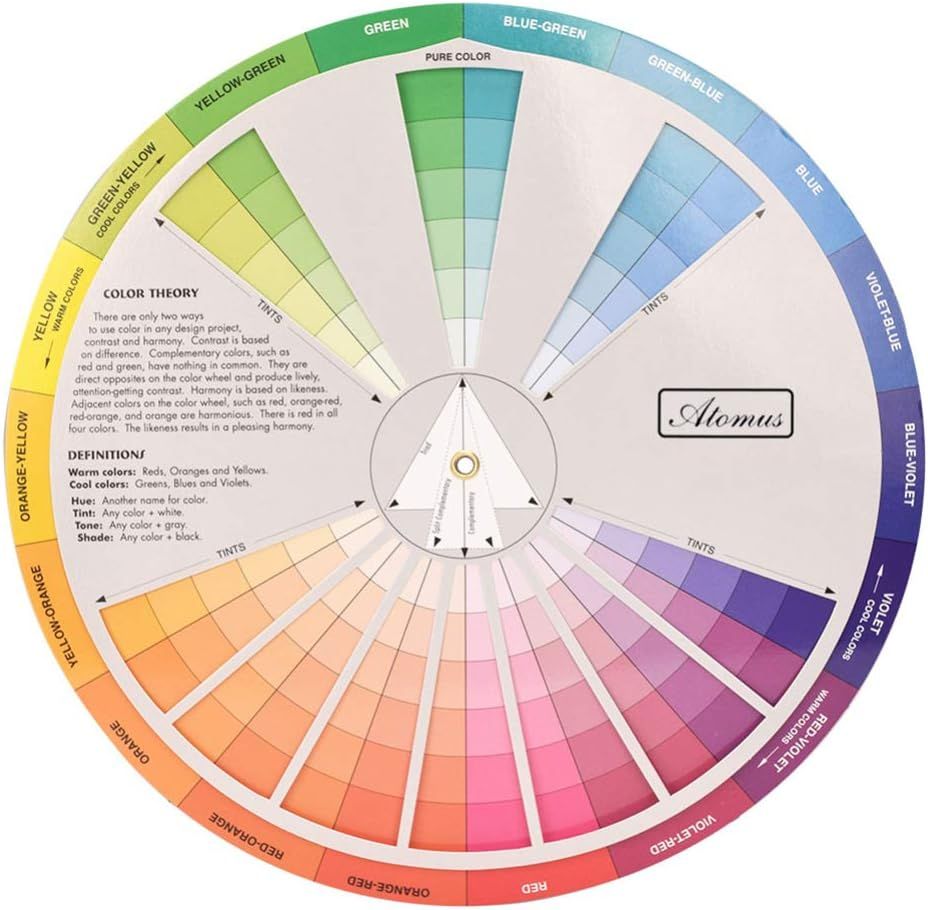
Keeping a colour wheel handy when designing a dish or thinking about plating options invaluable. It shows the main colours on the visible colour spectrum and their relationships to one another. This can help you decide on the colours you're going to use to enhance the visual appeal of your dish.
- It can enhance the visual appeal of a dish by guiding you in selecting complementary and harmonious colours. A well-balanced colour scheme makes the dish more enticing and pleasing to the eye.
- It can help you to understand contrast and balance. Contrast, created by complementary colours (opposites on the colour wheel), can make different elements of a dish stand out. On the other hand, analogous colours (next to each other on the wheel) can create a harmonious and balanced look.
- Warm colours like reds, oranges, and yellows are often known to stimulate appetite or make food appear more appetising. Understanding colour psychology can help us create dishes that are not only visually appealing but also increase the perceived tastiness.
- Seasonal ingredients often come in specific colours too. We can use a colour wheel to match the colour palette of a dish with the season. This creates a connection between the visual presentation and the freshness of the ingredients.
Please Note: The link below is an affiliate link. As an Amazon Associate I earn from qualifying purchases. If you click through and make a purchase, I will get a commission at no extra cost to you.